一、數(shù)據(jù)可視化概述
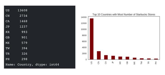
數(shù)據(jù)可視化是在整個數(shù)據(jù)分析非常重要的一個輔助工具,可以清晰的理解數(shù)據(jù),從而調(diào)整我們的分析方法。
- 能將數(shù)據(jù)進(jìn)行可視化,更直觀的呈現(xiàn)
- 使數(shù)據(jù)更加客觀、更具說服力
例如下面兩個圖為數(shù)字展示和圖形展示:

二、Python中的數(shù)據(jù)可視化(Matplotlib)
數(shù)據(jù)可視化與python語言也有相應(yīng)的結(jié)合,這就是今天我們要說的Matplotlib.
[Matplotlib官網(wǎng)](https://matplotlib.org/)
Matplotlib是一個Python 2D繪圖庫,它可以在各種平臺上以各種硬拷貝格式和交互式環(huán)境生成出具有出版品質(zhì)的圖形。 Matplotlib可用于Python腳本,Python和IPython shell,Jupyter筆記本,Web應(yīng)用程序服務(wù)器和四個圖形用戶界面工具包。
Matplotlib試圖讓簡單的事情變得更簡b單,讓無法實現(xiàn)的事情變得可能實現(xiàn)。 只需幾行代碼即可生成繪圖,直方圖,折線圖,條形圖,錯誤圖,散點圖等。
為了簡單繪圖,pyplot模塊提供了類似于MATLAB的界面,特別是與IPython結(jié)合使用時。 對于高級用戶,您可以通過面向?qū)ο蟮慕缑婊騇ATLAB用戶熟悉的一組函數(shù)完全控制線條樣式,字體屬性,軸屬性等。
在使用Matplotlib之前,我們需要有一些準(zhǔn)備的步驟,因為Matplotlib包不在python原生包含范圍之內(nèi)
1. Python環(huán)境是使用anaconda安裝的并創(chuàng)建了虛擬環(huán)境。
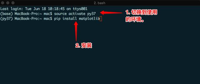
> 注意:windows下切換環(huán)境,不需要加source。
2. 如果是直接在官網(wǎng)下載并安裝的Python,可以直接`pip install Matplotlib`
三. 常見圖形種類及意義
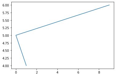
* 折線圖:以折線的上升或下降來表示統(tǒng)計數(shù)量的增減變化的統(tǒng)計圖
**特點:能夠顯示數(shù)據(jù)的變化趨勢,反映事物的變化情況。(變化)**
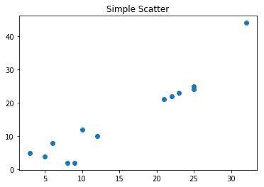
* 散點圖:用兩組數(shù)據(jù)構(gòu)成多個坐標(biāo)點,考察坐標(biāo)點的分布,判斷兩變量之間是否存在某種關(guān)聯(lián)或總結(jié)坐標(biāo)點的分布模式。
**特點:判斷變量之間是否存在數(shù)量關(guān)聯(lián)趨勢,展示離群點(分布規(guī)律)**
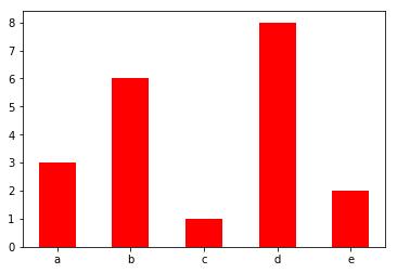
* 柱狀圖:排列在工作表的列或行中的數(shù)據(jù)可以繪制到柱狀圖中。
**特點:繪制連離散的數(shù)據(jù),能夠一眼看出各個數(shù)據(jù)的大小,比較數(shù)據(jù)之間的差別。(統(tǒng)計/對比)**
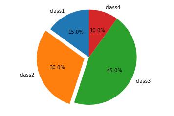
* 餅圖:用于表示不同分類的占比情況,通過弧度大小來對比各種分類。
**特點:分類數(shù)據(jù)的占比情況(占比)**
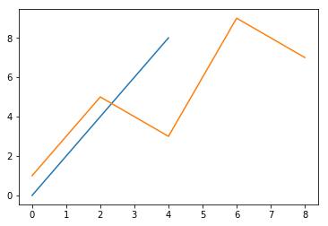
四. Matplotlib畫圖的簡單實現(xiàn)
```python?
# 導(dǎo)入模塊
import matplotlib.pyplot as plt
# 在jupyter中執(zhí)行的時候顯示圖片
%matplotlib inline
# 傳入x和y, 通過plot畫圖
plt.plot([1, 0, 9], [4, 5, 6])
# 在執(zhí)行程序的時候展示圖形
plt.show()
```
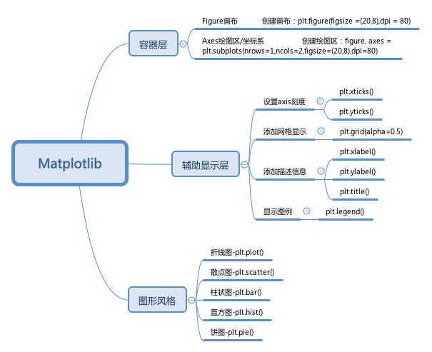
五. 對Matplotlib圖像結(jié)構(gòu)的認(rèn)識
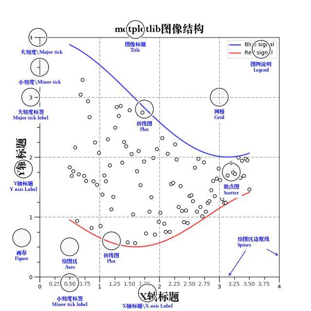
通常情況下,我們可以將一張Matplotlib圖像分成三層結(jié)構(gòu):
1. 第一層是底層的容器層,主要包括Canvas、Figure、Axes;
2. 第二層是輔助顯示層,主要包括axis、spines、grid、legend、title等;
3. 第三層為圖像層,即通過plot、scatter等方法繪制的圖像。
六. 折線圖
6.1 折線圖的繪制
```python
from matplotlib import pyplot as plt
x = range(1,8) # x軸的位置
y = [17, 17, 18, 15, 11, 11, 13]
# 傳入x和y, 通過plot畫折線圖
plt.plot(x,y)
plt.show()
```
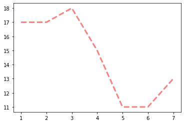
6.2 折線的顏色和形狀設(shè)置
```python
from matplotlib import pyplot as plt
x = range(1,8) # x軸的位置
y = [17, 17, 18, 15, 11, 11, 13]
# 傳入x和y, 通過plot畫折線圖
plt.plot(x, y, color='red',alpha=0.5,linestyle='--',linewidth=3)
plt.show()
'''基礎(chǔ)屬性設(shè)置
color='red' : 折線的顏色
alpha=0.5   : 折線的透明度(0-1)
linestyle='--' : 折線的樣式
linewidth=3  : 折線的寬度
'''
'''線的樣式
-      實線(solid)
--     短線(dashed)
-.     短點相間線(dashdot)
:    虛點線(dotted)
'''
```
6.3 折點樣式
```python
from matplotlib import pyplot as plt
x = range(1,8) # x軸的位置
y = [17, 17, 18, 15, 11, 11, 13]
# 傳入x和y, 通過plot畫折線圖
plt.plot(x, y, marker='o',color = 'red',markersize='20',markeredgecolor='g',markeredgewidth = 5)
plt.show()
```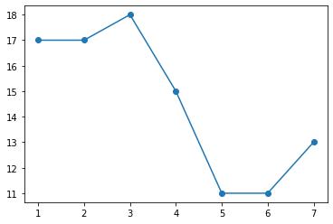
**折點形狀選擇:**
| character | description |
| --------- | --------------------- |
| '-' | solid line style |
| '--' | dashed line style |
| '-.' | dash-dot line style |
| ':' | dotted line style |
| '.' | point marker |
| ',' | pixel marker |
| 'o' | circle marker |
| 'v' | triangle_down marker |
| '^' | triangle_up marker |
| '<' | triangle_left marker |
| '>' | triangle_right marker |
| '1' | tri_down marker |
| '2' | tri_up marker |
| '3' | tri_left marker |
| '4' | tri_right marker |
| 's' | square marker |
| 'p' | pentagon marker |
| '*' | star marker |
| 'h' | hexagon1 marker |
| 'H' | hexagon2 marker |
| '+' | plus marker |
| 'x' | x marker |
| 'D' | diamond marker |
| 'd' | thin_diamond marker |
| '|' | vline marker |
| '_' | hline marker |
6.4 設(shè)置的圖片的大小和保存
```python
from matplotlib import pyplot as plt
import random
x = range(2,26,2) # x軸的位置
y = [random.randint(15, 30) for i in x]

# 設(shè)置圖片的大小
'''
figsize:指定figure的寬和高,單位為英寸;
dpi參數(shù)指定繪圖對象的分辨率,即每英寸多少個像素,缺省值為80 ? ? ?1英寸等于2.5cm,A4紙是 21*30cm的紙張?
'''
# 根據(jù)畫布對象
plt.figure(figsize=(20,8),dpi=80)
plt.plot(x,y)  # 傳入x和y, 通過plot畫圖
# plt.show()
# 保存(注意: 要放在繪制的下面,并且plt.show()會釋放figure資源,如果在顯示圖像之后保存圖片將只能保存空圖片。)
plt.savefig('./t1.png')
# 圖片的格式也可以保存為svg這種矢量圖格式,這種矢量圖放在網(wǎng)頁中放大后不會有鋸齒
# plt.savefig('./t1.svg')
```
6.5 繪制x軸和y軸的刻度
```python
from matplotlib import pyplot as plt
x = range(2,26,2) # x軸的位置
y = [random.randint(15, 30) for i in x]
plt.figure(figsize=(20,8),dpi=80)

# 設(shè)置x軸的刻度
# plt.xticks(x)
# plt.xticks(range(1,25))
# 設(shè)置y軸的刻度
# plt.yticks(y)
# plt.yticks(range(min(y),max(y)+1))

# 構(gòu)造x軸刻度標(biāo)簽
x_ticks_label = ["{}:00".format(i) for i in x]
#rotation = 45 讓字旋轉(zhuǎn)45度
plt.xticks(x,x_ticks_label,rotation = 45)
# 設(shè)置y軸的刻度標(biāo)簽
y_ticks_label = ["{}℃".format(i) for i in range(min(y),max(y)+1)]
plt.yticks(range(min(y),max(y)+1),y_ticks_label)

plt.plot(x,y)
plt.show()
```
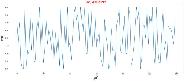
6.6 設(shè)置顯示中文
```python
# matplotlib只顯示英文,無法顯示中文,需要修改matplotlib的默認(rèn)字體
# 通過matplotlib下的font_manager可以解決

# 兩個小時內(nèi)的每分鐘跳動變化
from matplotlib import pyplot as plt
import matplotlib
import random
x = range(0,120)
y = [random.randint(10,30) for i in range(120)]

plt.figure(figsize=(20,8),dpi=80)
plt.plot(x,y)

# 加坐標(biāo)軸信息
'''另外一種寫法
查看linux、mac下支持的字體
		終端執(zhí)行: fc-list
		查看支持的中文(冒號前面有空格) fc-list :lang=zh
查看Windows下的字體:“C:WindowsFonts”

可以自己下載字體文件(xxx.ttf),然后雙擊安裝即可
# my_font = font_manager.FontProperties(fname='/System/Library/Fonts/PingFang.ttc',size=18)
# plt.ylabel("天氣",fontproperties=my_font)
'''

#rotation將字體旋轉(zhuǎn)45度
plt.xlabel('時間',rotation=45)

from matplotlib import font_manager
my_font = font_manager.FontProperties(fname='/System/Library/Fonts/PingFang.ttc',size=18)
plt.ylabel("次數(shù)",fontproperties=my_font)

# 設(shè)置標(biāo)題
plt.title('每分鐘跳動次數(shù)',fontproperties=my_font,color='red')

plt.show()
```
6.7 一圖多線
```python
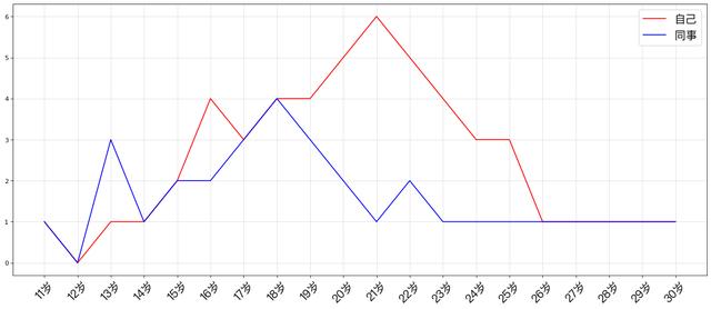
# 假設(shè)大家在30歲的時候,根據(jù)自己的實際情況,統(tǒng)計出來你和你同事各自從11歲到30歲每年交的男/女朋友的數(shù)量如列表y1和y2,請在一個圖中繪制出該數(shù)據(jù)的折線圖,從而分析每年交朋友的數(shù)量走勢。
y1 = [1,0,1,1,2,4,3,4,4,5,6,5,4,3,3,1,1,1,1,1]
y2 = [1,0,3,1,2,2,3,4,3,2,1,2,1,1,1,1,1,1,1,1]
x = range(11,31)
# 設(shè)置圖形
plt.figure(figsize=(20,8),dpi=80)
plt.plot(x,y1,color='red',label='自己')
plt.plot(x,y2,color='blue',label='同事')
# 設(shè)置x軸刻度
xtick_labels = ['{}歲'.format(i) for i in x]
my_font = font_manager.FontProperties(fname='/System/Library/Fonts/PingFang.ttc',size=18)
plt.xticks(x,xtick_labels,fontproperties=my_font,rotation=45)
# 繪制網(wǎng)格(網(wǎng)格也是可以設(shè)置線的樣式)
#alpha=0.4 設(shè)置透明度
plt.grid(alpha=0.4)
# 添加圖例(注意:只有在這里需要添加prop參數(shù)是顯示中文,其他的都用fontproperties)
# 設(shè)置位置loc : upper left、 lower left、 center left、 upper center
plt.legend(prop=my_font,loc='upper right')
#展示
plt.show()
```
七. 繪制散點圖
```python
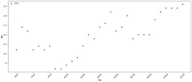
'''題干
3月份每天最高氣溫
a = [11,17,16,11,12,11,12,6,6,7,8,9,12,15,14,17,18,21,16,17,20,14,15,15,15,19,21,22,22,22,23]
'''
from matplotlib import pyplot as plt
from matplotlib import font_manager
import numpy as np
y = [11,17,16,11,12,11,12,6,6,7,8,9,12,15,14,17,18,21,16,17,20,14,15,15,15,19,21,22,22,22,23]
x = range(1,32)
# 設(shè)置圖形大小
plt.figure(figsize=(20,8),dpi=80)
# 使用scatter繪制散點圖
size = np.random.randint(0, 100, 31) # 設(shè)置大小
plt.scatter(x,y,label= '3月份',alpha=0.5,s=size,c='red')
# 調(diào)整x軸的刻度
my_font = font_manager.FontProperties(fname='/System/Library/Fonts/PingFang.ttc',size=10)
_xticks_labels = ['3月{}日'.format(i) for i in x]
plt.xticks(x[::3],_xticks_labels[::3],fontproperties=my_font,rotation=45)
_yticks_labels = ['{}°C'.format(i) for i in range(min(y),max(y)+1)]
plt.yticks(range(min(y),max(y)+1),_yticks_labels)
plt.xlabel('日期',fontproperties=my_font)
plt.ylabel('溫度',fontproperties=my_font)
# 圖例
plt.legend(prop=my_font)
plt.show()
```
八. 繪制條形圖
```python
'''
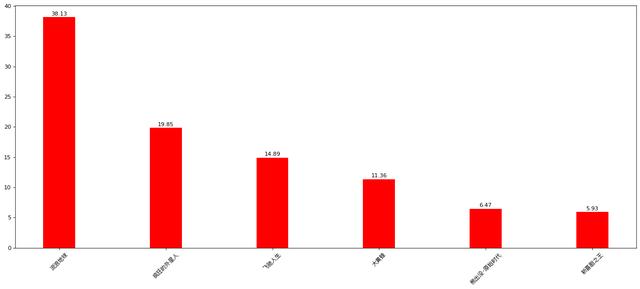
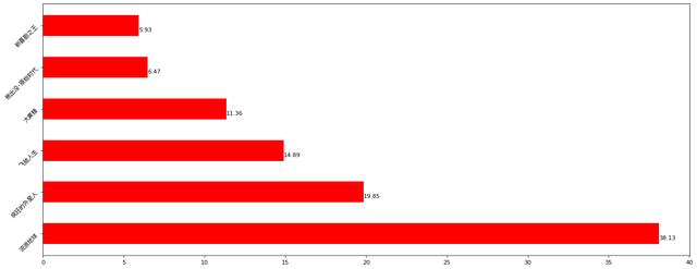
假設(shè)你獲取到了2019年內(nèi)地電影票房前20的電影(列表a)和電影票房數(shù)據(jù)(列表b),請展示該數(shù)據(jù)
a = ['流浪地球','瘋狂的外星人','飛馳人生','大黃蜂','熊出沒·原始時代','新喜劇之王']
b = ['38.13','19.85','14.89','11.36','6.47','5.93']
'''
from matplotlib import pyplot as plt
from matplotlib import font_manager
a = ['流浪地球','瘋狂的外星人','飛馳人生','大黃蜂','熊出沒·原始時代','新喜劇之王']
b = ['38.13','19.85','14.89','11.36','6.47','5.93']
# b =[38.13,19.85,14.89,11.36,6.47,5.93]
my_font = font_manager.FontProperties(fname='/System/Library/Fonts/PingFang.ttc',size=10)
plt.figure(figsize=(20,8),dpi=80)
# 繪制條形圖
rects = plt.bar(a,[float(i) for i in b],width=0.3,color=['r','g','b','r','g','b'])
plt.xticks(range(len(a)),a,fontproperties=my_font)
plt.yticks(range(0,41,5),range(0,41,5))
# 在條形圖上加標(biāo)注(水平居中)
for rect in rects:
height = rect.get_height()
plt.text(rect.get_x() + rect.get_width() / 2, height+0.3, str(height),ha="center")
plt.show()
```
**橫向條形圖**
```python
# 橫向柱狀圖
from matplotlib import pyplot as plt
from matplotlib import font_manager
my_font = font_manager.FontProperties(fname='/System/Library/Fonts/PingFang.ttc',size=10)
a = ['流浪地球','瘋狂的外星人','飛馳人生','大黃蜂','熊出沒·原始時代','新喜劇之王']
b = [38.13,19.85,14.89,11.36,6.47,5.93]

plt.figure(figsize=(20,8),dpi=80)
# 繪制條形圖的方法
'''
height=0.3  條形的寬度
'''
# 繪制橫向的條形圖
# plt.bar(y,x,width = 0.4)
rects = plt.barh(range(len(a)),b,height=0.5,color='r')
plt.yticks(range(len(a)),a,fontproperties=my_font,rotation=45)

# 在條形圖上加標(biāo)注(水平居中)
for rect in rects:
	# print(rect.get_x())
	width = rect.get_width()
	plt.text(width, rect.get_y()+0.5/2, str(width),va="center")

plt.show()
```
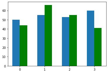
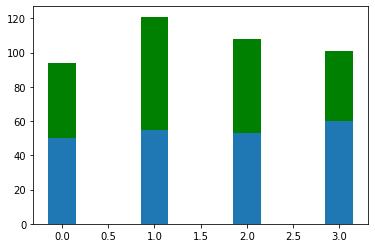
**并列和羅列條形圖**
```python
import matplotlib.pyplot as plt
import numpy as np
index = np.arange(4)
BJ = [50,55,53,60]
Sh = [44,66,55,41]
# 并列
plt.bar(index,BJ,width=0.3)
plt.bar(index+0.3,Sh,width=0.3,color='green')

plt.xticks(index+0.3/2,index)
# 羅列
# plt.bar(index,Sh,bottom=BJ,width=0.3,color='green')
plt.show()
```
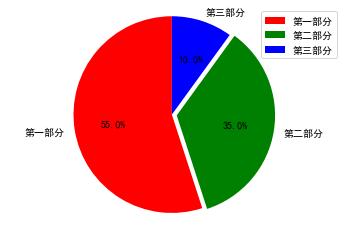
九. 餅狀圖
```python
import matplotlib.pyplot as plt
import matplotlib
from matplotlib import font_manager
my_font = font_manager.FontProperties(fname='/System/Library/Fonts/PingFang.ttc',size=10)

label_list = ["第一部分", "第二部分", "第三部分"]    # 各部分標(biāo)簽
size = [55, 35, 10]    # 各部分大小
color = ["red", "green", "blue"]     # 各部分顏色
explode = [0, 0.05, 0]   # 各部分突出值
"""
繪制餅圖
x : (每一塊)的比例,如果sum(x)>1,會將多出的部分進(jìn)行均分;
explode: (每一塊)離開中心距離
labels: (每一塊)餅圖外側(cè)顯示的說明文字;
labeldistance:設(shè)置標(biāo)簽文本距圓心位置,1.1表示1.1倍半徑
autopct:控制餅圖內(nèi)百分比設(shè)置
shadow:設(shè)置是否有陰影
startangle:起始繪制角度,默認(rèn)圖是從x軸正方向逆時針畫起,如設(shè)定=90則從y軸正方向畫起;
pctdistance:類似于labeldistance,指定autopct的位置刻度,默認(rèn)值為0.6;
返回值:
patches : matplotlib.patches.Wedge列表(扇形實例)
l_text:label matplotlib.text.Text列表(標(biāo)簽實例)
p_text:label matplotlib.text.Text列表(百分比標(biāo)簽實例)
"""
plt.figure(figsize=(20, 8), dpi=100)
patches, l_text, p_text = plt.pie(size,
                                  explode=explode,
                                  colors=color,
                                  labels=label_list,
                                  labeldistance=1.1,
                                  autopct="%1.1f%%",
                                  shadow=False,
                                  startangle=90,
                                  pctdistance=0.6)

for t in l_text:
    print(dir(t))
    t.set_fontproperties(my_font)

for t in p_text:
    t.set_size(18)

for i in patches:
    i.set_color('pink')
    break

plt.show()
```
十.總結(jié)
使用**Matplotlib**進(jìn)行數(shù)據(jù)可視化十分方便,從而使數(shù)據(jù)更加直觀的展現(xiàn).我們通過以上幾個直觀繪制常見圖形會發(fā)現(xiàn)**根據(jù)不同需求選擇出對的圖形展示**,是我們核心使用**Matplotlib**進(jìn)行數(shù)據(jù)可視化的重中之重.而核心的Api使用起來又十分便捷.下方圖片整理了不同圖層結(jié)構(gòu)下的**Matplotlib**進(jìn)行了一個很好的總結(jié).